Essays
Writing about product design in practice.
Notes from building fintech products, observing real users, and turning messy interface decisions into clearer product judgment.
Featured essay
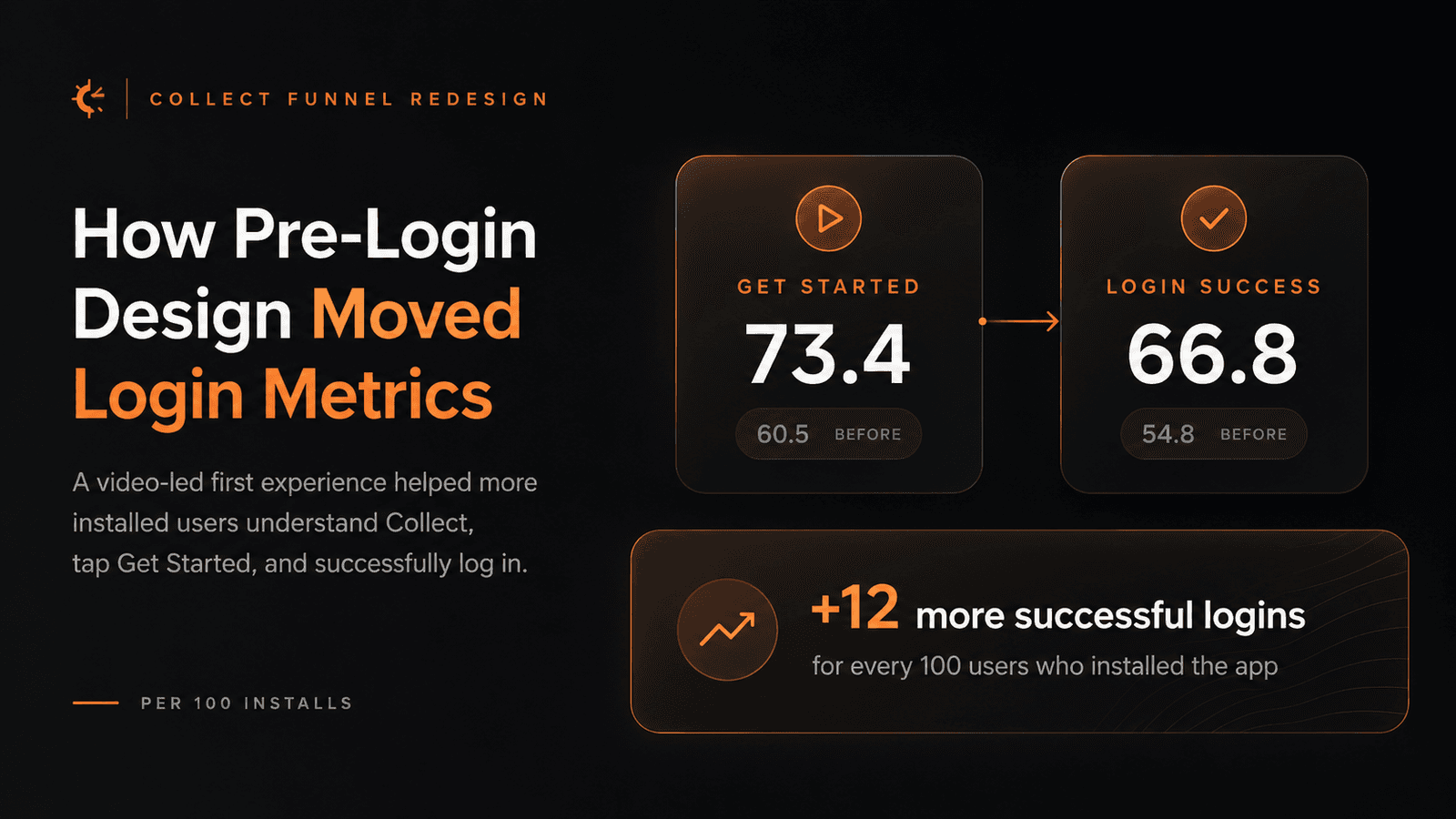
How Pre-Login Design Moved Login Metrics
A pre-login redesign in Collect replaced static value props with video-led product context. The result was not just a cleaner first screen: per 100 installs, more users clicked Get Started and more users successfully logged in.
I Built a Figma Plugin That Doesn't Need an API Key
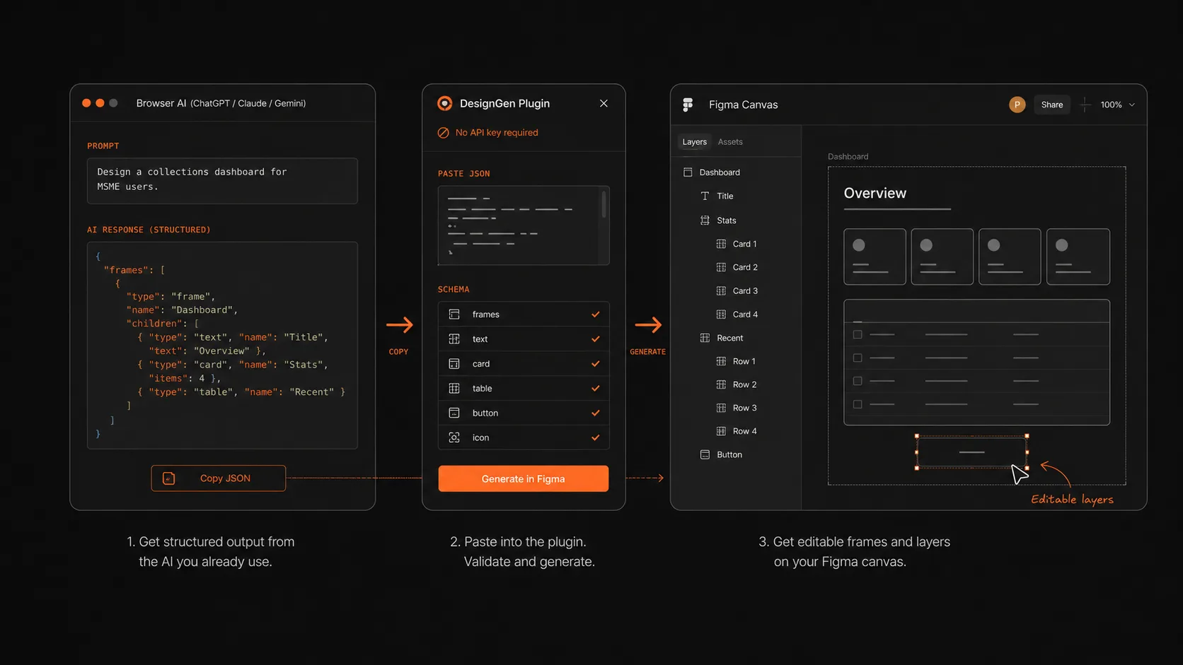
Every AI design tool asks designers to bring an API key, a billing account, or a new workflow. DesignGen takes a smaller bet: designers already have browser AI open, so the plugin turns that output into editable Figma layers.
The Confirmation Screen Nobody Sees
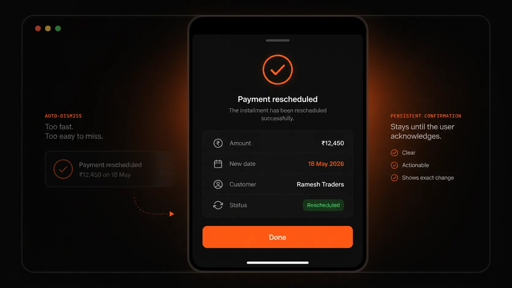
A confirmation that disappears on its own is designed for the system, not the user. Collect’s MSME users were often serving a customer when they tapped an action, so the confirmation needed to wait and show exactly what changed.
The Psychology Laws That Quietly Run Every Interface
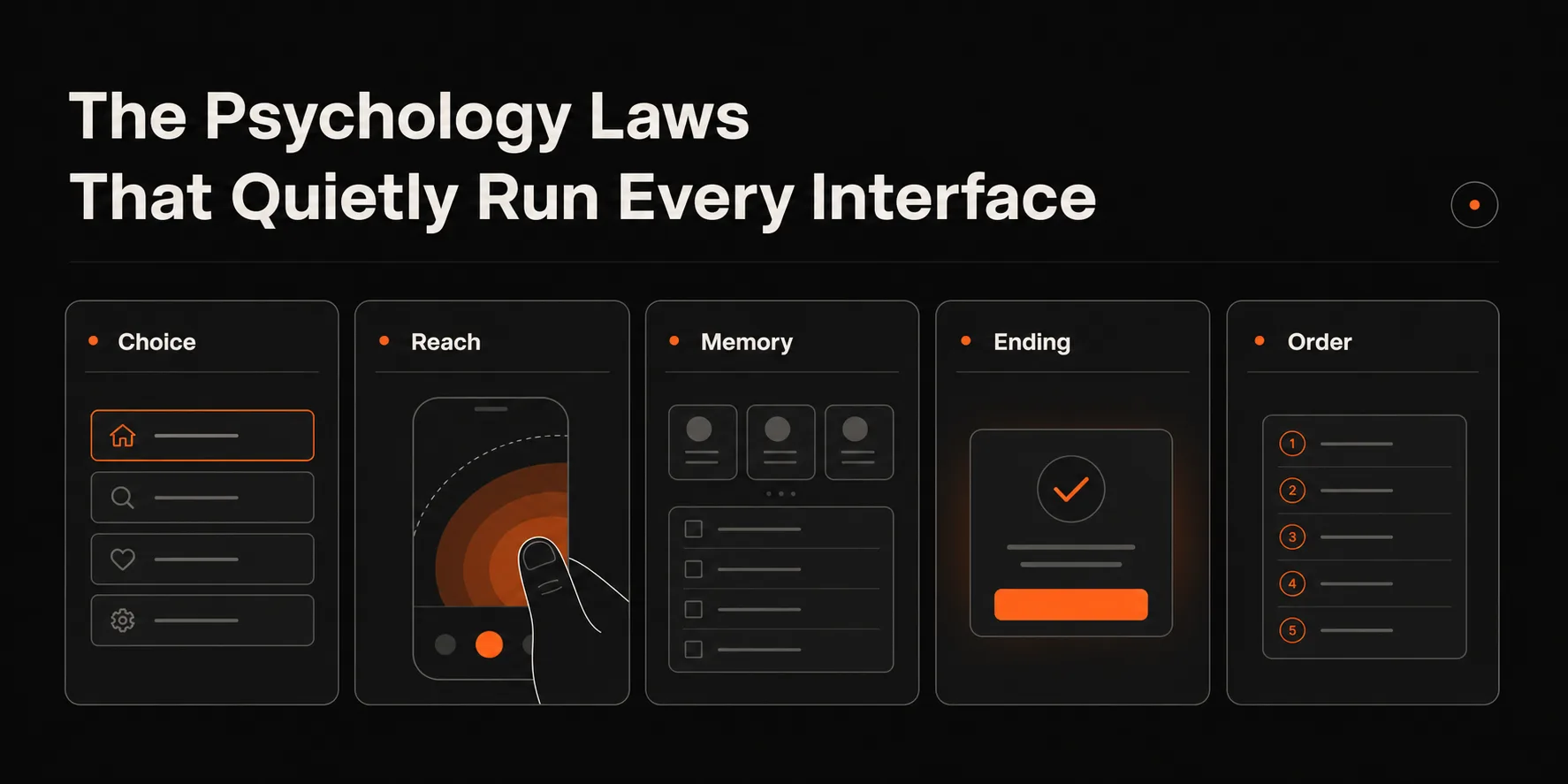
The best-known psychology laws are not trivia for design decks. They are practical constraints on choice, reach, memory, endings, and order. Ignore them and the interface starts fighting the user’s cognition.
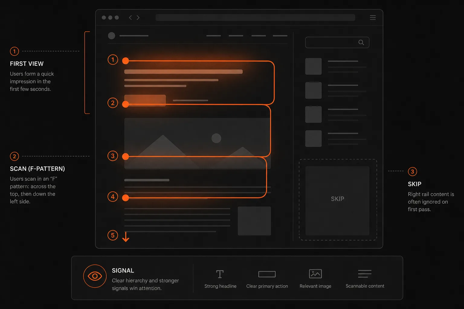
What Users Are Actually Doing on Your Page
Users do not read pages in the order designers imagine. They scan, skip, judge quality quickly, and ignore anything that looks like noise. Good page design starts by accepting that attention is selective.
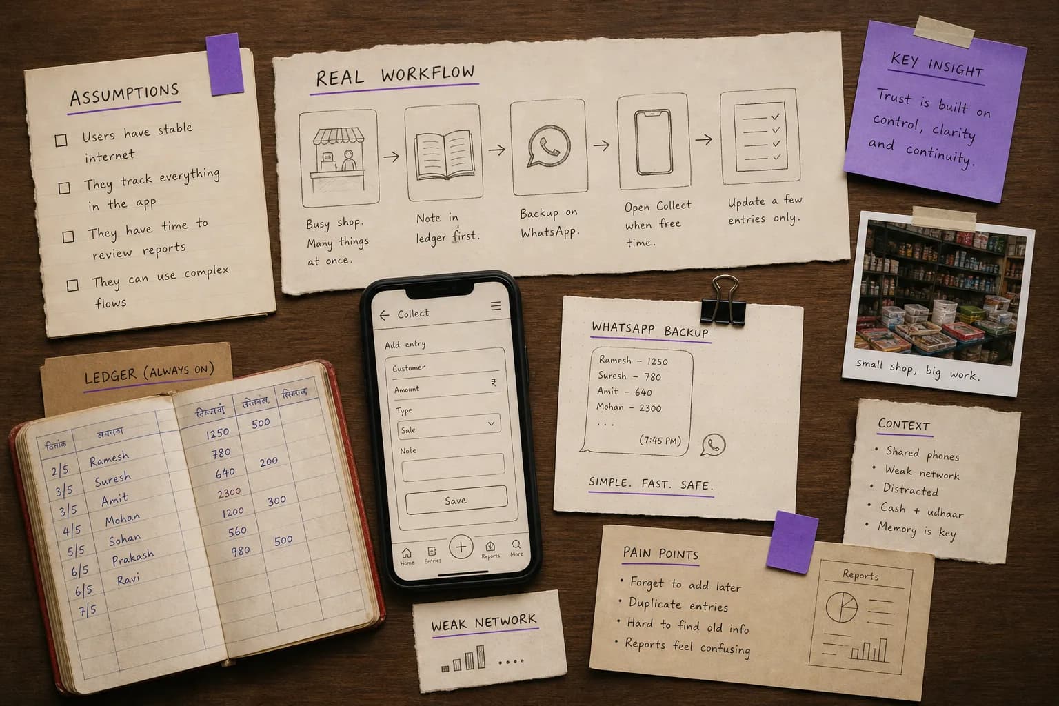
Designing for Users You Haven't Met
Designing for users unlike yourself exposes every hidden assumption in the interface. Vocabulary, device quality, attention, network reliability, and trust all become design materials.
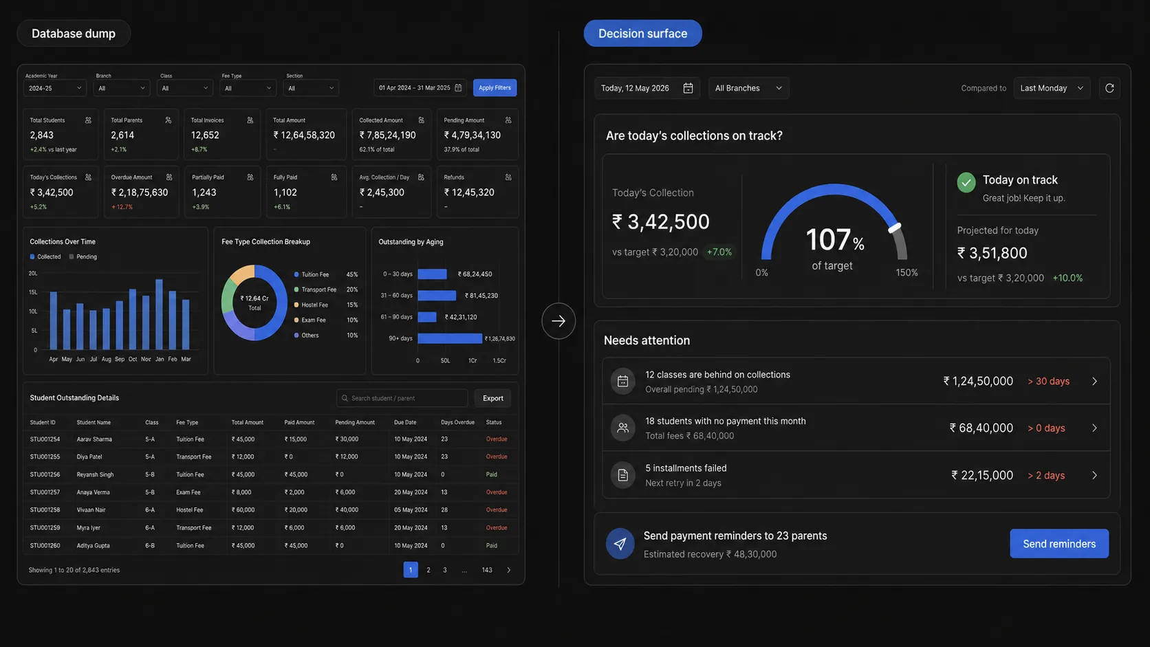
The Dashboard Design Trap
Bad dashboards usually do not fail because they lack data. They fail because they show too much data at the same weight. A dashboard should answer one operational question quickly, then help users drill deeper.
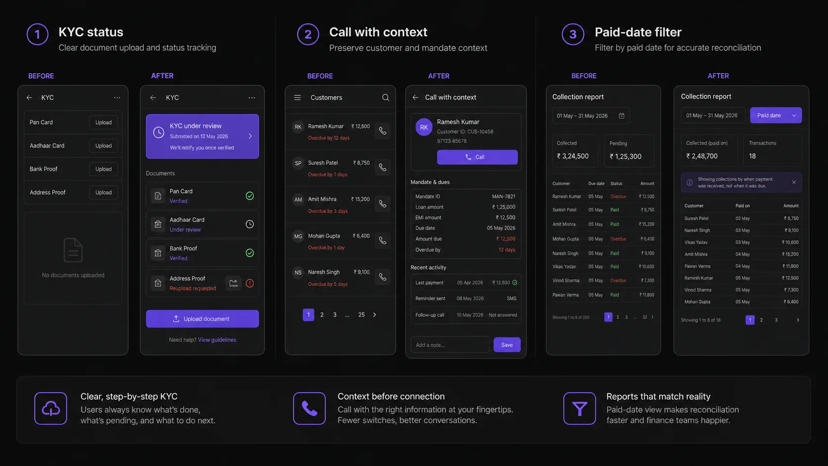
Three UX Problems We Fixed in Collect
Collect taught me that trust is not one screen or one badge. It is built through visible states, preserved context, and filters that match how users actually reconcile money.
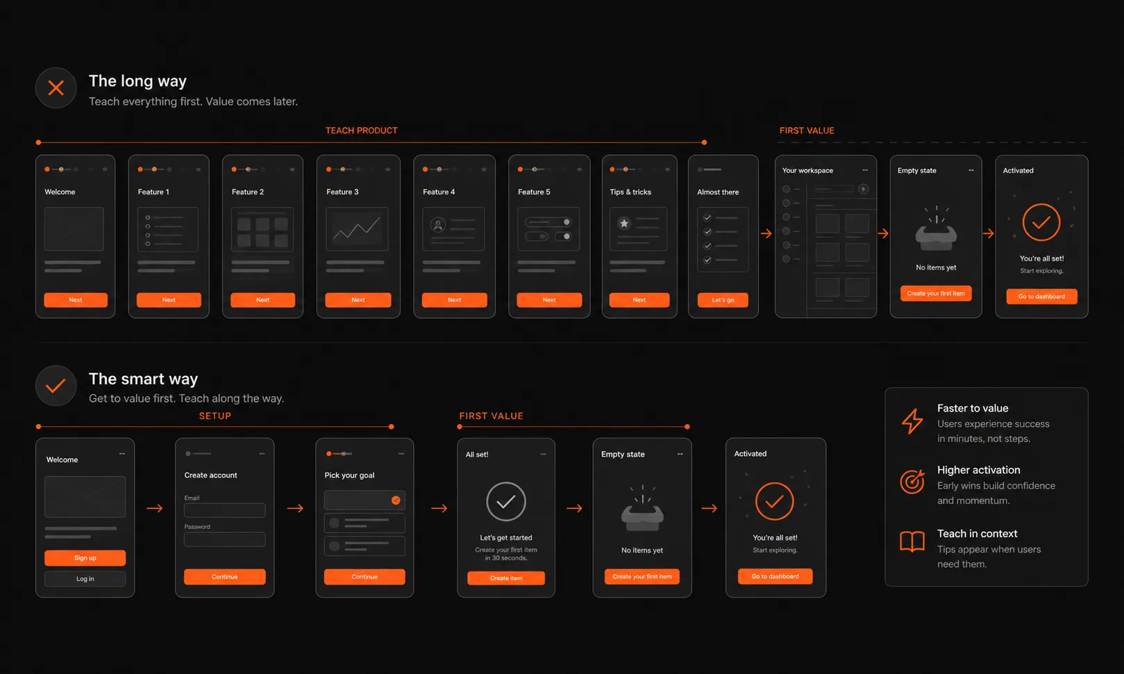
The Onboarding Paradox
Most onboarding flows try to teach the product. The better goal is activation: get users to a meaningful outcome quickly enough that they have a reason to keep learning.