Three UX Problems We Fixed in Collect
Collect is a payment collection app for Indian MSMEs — jewellers, retailers, distributors. I designed it from zero. These are three real problems users had, what we learned from each, and how we fixed them.
The onboarding flow nobody could finish
When I joined to design Collect, the onboarding process for a new business owner worked like this: sign up, enter your business details, then WhatsApp your KYC documents — Aadhaar, PAN, GST certificate — to a phone number listed in the app. Then wait. Nobody told you how long. Nobody told you what was happening with your documents. You just waited.
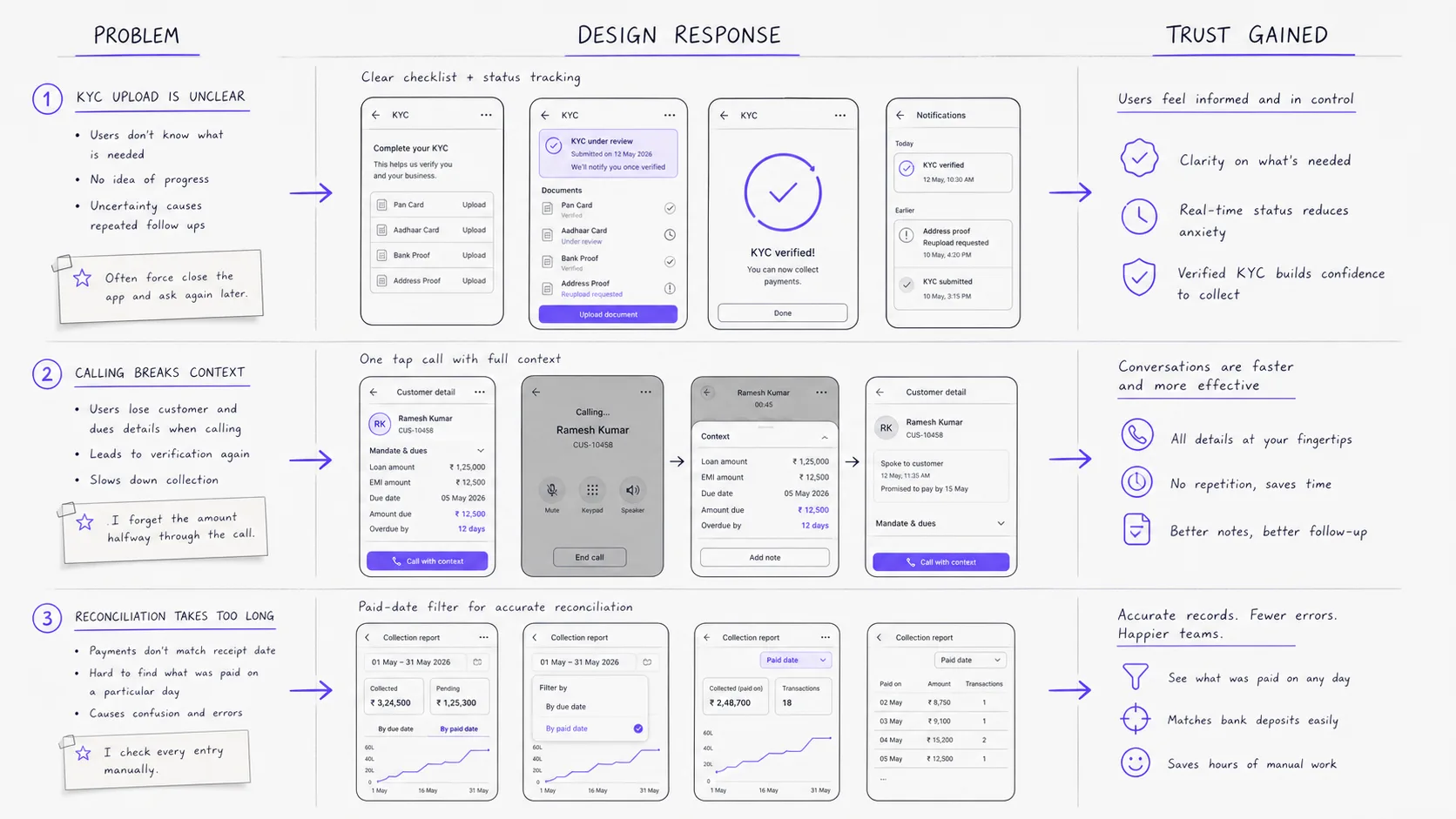
The drop-off at this step was significant. When I looked at the data and talked to users who hadn't completed setup, the problem was obvious. We were asking a business owner to trust a financial product with their identity documents — via WhatsApp. To a random number. With no acknowledgement that the documents were received, no visibility into the review process, and no timeline.
From a trust perspective, this was a disaster. The WhatsApp step broke three implicit promises simultaneously: "I'll keep this secure," "I'll keep you informed," and "I'll make this feel professional." A WhatsApp message to an unknown number fails all three.
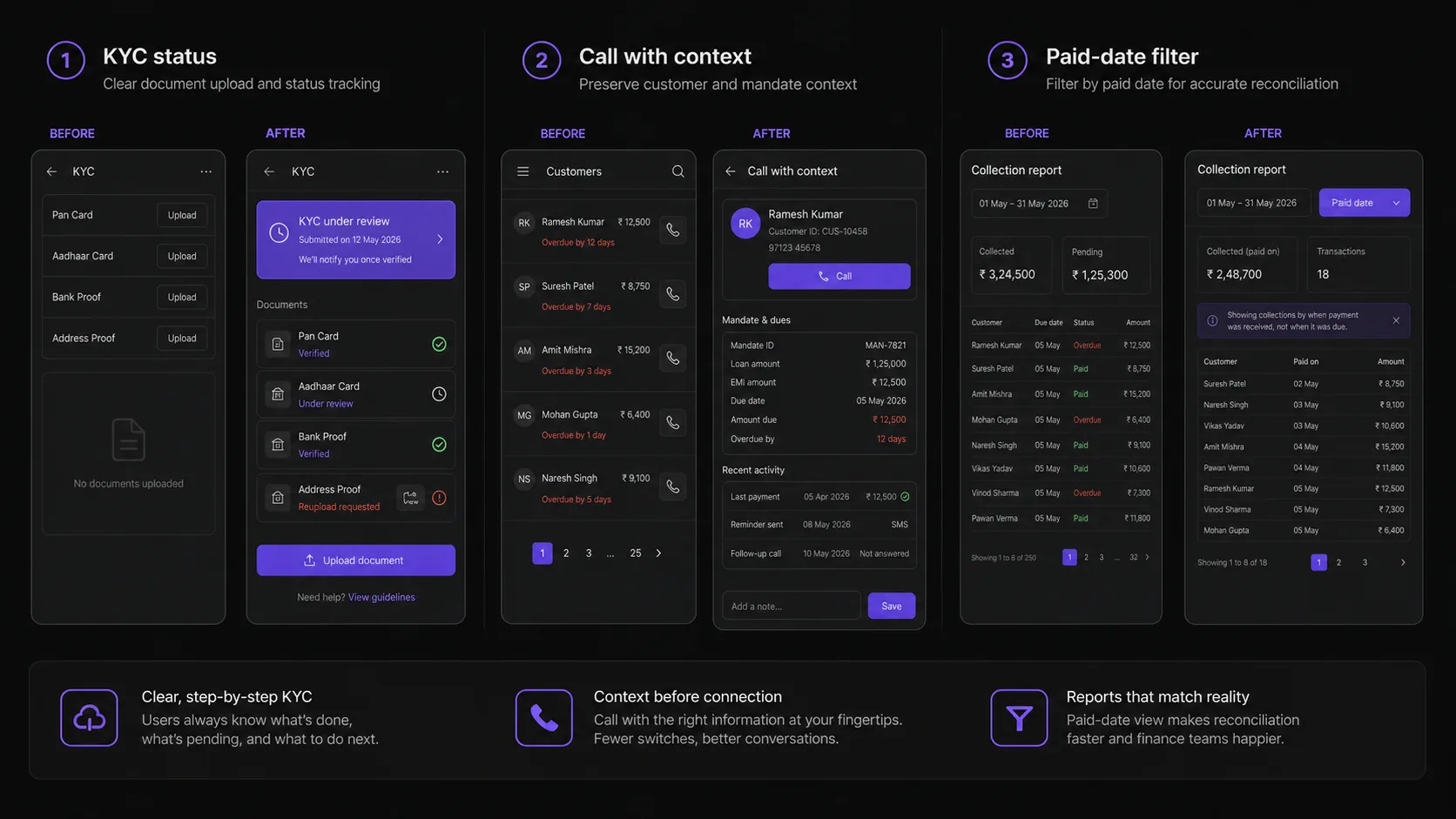
The fix was building the entire KYC and document collection flow inside the app. Users photograph their documents using the camera, upload them directly, and immediately see a status: "Documents received — review typically takes 2 business hours." Every state is visible: submitted, under review, approved, action needed. If something is rejected, the reason is clear and the re-upload is one tap.
Completion rates improved substantially. But the more important change was qualitative: users who completed onboarding in-app had significantly higher first-week activity than users who had gone through the WhatsApp process. They trusted the product more because the onboarding process felt like it respected their documents.
The context switch that was costing collections
Collect's core job is to help business owners collect payments from their customers. A significant part of that job is calling customers who haven't paid — following up on overdue amounts, clarifying payment issues, reminding them about upcoming dues.
The mandate details screen shows everything about a customer's payment mandate: the amount, due dates, payment history, outstanding balance. It's the screen a collections manager lives on when they're working through their follow-up list.
Before: to call a customer, you'd look at their phone number on the mandate screen, memorise it (or screenshot it), leave the app, open your phone's dialer, type the number, make the call, then come back to Collect and try to remember where you were and what you were going to say.
That context switch — leaving the app, making the call, returning — breaks the mental state completely. By the time you're back in Collect, you've lost your place. You don't remember which customer you were looking at, what the outstanding balance was, what the conversation was about.
The fix was a single call icon on the mandate details screen. Tapping it opens the system dialer with the customer's number pre-filled — one tap to call. The Collect screen stays open in the background. When the call ends, users are immediately back in the context they were in: the right customer, the right mandate details, the full payment history visible.
This sounds like a small change. It shifted how users approached their follow-up workflow. Because calling no longer meant losing context, more users started calling from within their collection workflow rather than maintaining separate call lists. The feature made the existing data more useful.
The filter we were missing
Collect's instalment page shows payment data across all customers and all mandates. Early on, the only filter available was by due date — you could see "payments due this week," "overdue," "upcoming." This felt logical from a collections standpoint: the primary job is knowing who owes what and when.
During user interviews with business owners who had been using the product for two or three months, I noticed a pattern. At the end of each month, they'd spend significant time in the app trying to reconcile what had actually come in versus what was expected. They needed to answer: "Of everything that was supposed to be collected in April, how much was actually received, and when was it received?"
Due date filters couldn't answer this. A payment that was due in March but actually paid in April would appear under March in a due-date filter — confusing reconciliation completely.
The ask from users was consistent: let me filter by paid date. This sounds obvious in retrospect. But the original assumption was that collections teams think primarily in terms of when things are due. The interviews showed that finance and reconciliation is equally important — and for reconciliation, paid date is the primary axis.
We added paid date as a filter option alongside due date. The filter now lets users switch between "show by when it was due" and "show by when it was actually paid." For end-of-month reconciliation, this changed a 30-minute manual process into a 2-minute filtered view.
The broader lesson: the same data answers completely different questions depending on which axis you're filtering by. Assuming one axis serves all use cases is a product thinking failure, not a UI failure.