The Psychology Laws That Quietly Run Every Interface
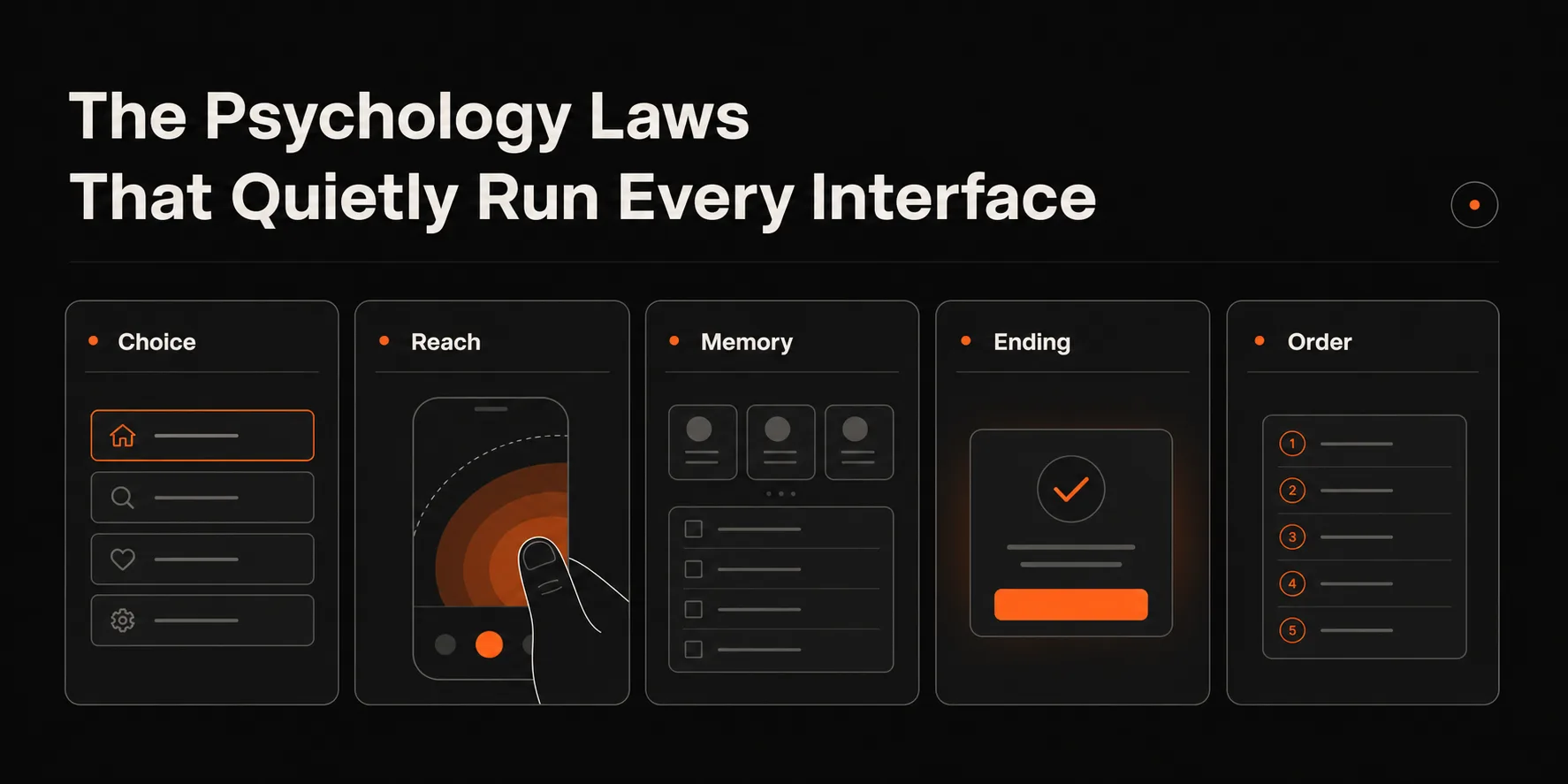
Hick's Law, Fitts's Law, Miller's Law, the Peak-End Rule, the Serial Position Effect. These are not abstract principles — they are measurable, replicated findings about how human cognition works. And they quietly determine whether your interface succeeds or fails.
01
Hick's Law: the jam study that changed product design
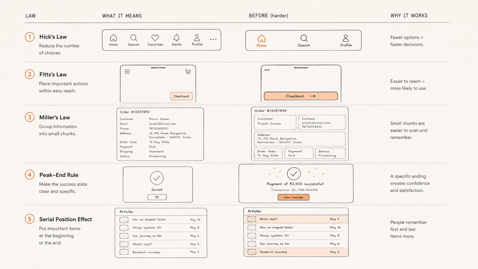
Hick's Law states that the time it takes to make a decision increases logarithmically with the number of choices. More options, slower decisions. The relationship is mathematically predictable and has been replicated in dozens of controlled experiments.
The most famous real-world test came from a 2000 study by Sheena Iyengar and Mark Lepper. They set up a jam tasting booth at a grocery store — sometimes with 6 jams, sometimes with 24. The large display attracted more browsers (60% stopped vs. 40%). But the small display drove dramatically more purchases: 30% of people who stopped at the 6-jam display bought something, versus 3% of people who stopped at the 24-jam display.
Ten times the conversion rate from one-fifth the options. This is not an edge case. The pattern holds across product categories, financial decisions, and digital interfaces. When users face too many options, the cognitive cost of choosing becomes higher than the perceived value of any single option, and they choose nothing.
The practical application for digital products: every screen with choices should have a recommended option clearly marked. Every menu with more than seven items should be reconsidered. Every onboarding flow that asks users to configure things before they understand the product is applying Hick's Law backwards — maximizing the friction at the exact moment users are most uncertain.
02
Fitts's Law: why the thumb zone is not optional
Fitts's Law, derived from studies of human motor performance in the 1950s, describes the time required to reach a target: it increases with distance and decreases with target size. Larger targets that are closer take less time to hit accurately. This is obvious in physical space and equally true on touchscreens.
The practical consequence for mobile design is the thumb zone. When a phone is held in one hand, the thumb can comfortably reach roughly the bottom two-thirds of the screen without readjusting the grip. The top corners — especially the top-right on a right-handed user — are the hardest to reach. Most navigation patterns put important actions in exactly the wrong place.
Research on natural thumb movement on smartphones found that 49% of users hold their phone with one hand and navigate with their thumb. Of those, the majority keep the thumb in the bottom-center zone. Any primary action — confirm, continue, submit, pay — placed outside this zone adds motor difficulty that compounds at scale. Every tap that requires a grip adjustment is a small friction that, across millions of sessions, adds up to significant drop-off.
The counterintuitive finding: gesture-based navigation (swipe up for home, swipe from edge for back) outperforms button-based navigation not because it is more modern, but because it maps more naturally to thumb movement patterns. Gestures can be triggered anywhere on the screen; buttons live in fixed locations that may or may not align with comfortable thumb reach.
03
Miller's Law: why chunking is a design principle, not a cliché
In 1956, George Miller published a paper titled 'The Magical Number Seven, Plus or Minus Two: Some Limits on our Capacity for Processing Information.' He found that working memory — the cognitive workspace used for active thinking — holds roughly 7 items (with a range of 5-9). Beyond that capacity, recall drops sharply.
Later research refined this: the limit is 4 chunks, not 7 items, and 'chunks' are units of meaningful information, not individual data points. A phone number presented as 9845023712 is 10 separate items. The same number presented as 984-502-3712 is 3 chunks — and significantly easier to remember and re-enter.
The design implication is not just 'use short lists.' It is that any interface element requiring users to hold information in working memory while doing something else will fail when the working memory limit is exceeded. A multi-step form that shows all fields at once. A checkout flow that asks for shipping address, payment details, and discount codes simultaneously. A dashboard with 12 metrics displayed at the same weight.
Chunking — grouping related items, using visual separation to define units, limiting simultaneous information load — is not aesthetic preference. It is a technical constraint of human cognition. Designs that violate it produce not just confusion but measurable task failure. The number of items a user can track simultaneously is finite and small.
04
The Peak-End Rule: why the last moment matters most
Daniel Kahneman's Peak-End Rule, supported by a now-famous colonoscopy study (yes, really), established that people's memory of an experience is determined almost entirely by two moments: the most intense moment (the peak) and how it ended. The duration of the experience barely matters. A longer, less painful procedure was rated better than a shorter but more painful one that ended badly.
The correlation between actual duration and remembered unpleasantness was r=0.03 — essentially zero. What drove the memory was the final minute. When researchers extended the procedure by adding a low-discomfort phase at the end, patients rated the entire experience as significantly less unpleasant — even though the total discomfort was higher.
Applied to digital products: users' memory of an interaction is shaped by the worst moment and the last moment — not the average of all moments. A flawless 10-step checkout that ends with a confusing confirmation screen will be remembered as confusing. A bumpy onboarding that ends with a clear, satisfying first success will be remembered as good.
This is why confirmation states are critically under-designed. The confirmation screen — the end of the experience — disproportionately shapes memory. A generic 'Order placed!' in small text is a missed opportunity. A confirmation that tells users exactly what happened, what comes next, and makes them feel good about the decision they just made leverages the Peak-End Rule intentionally. The ending is the memory.
05
Serial Position Effect: why first and last items get remembered
The Serial Position Effect describes a consistent pattern in recall: items at the beginning of a list (primacy effect) and items at the end (recency effect) are remembered significantly better than items in the middle. Middle items are recalled least reliably.
This was first documented in verbal learning experiments and holds across visual displays, navigation menus, and feature lists. A navigation with five items will have the first and last items recalled most often. A pricing table with three plans will have the first and third evaluated more carefully than the second.
The practical consequence: if you have a feature, option, or call to action you want users to remember or choose, put it first or last — never in the middle. If you have three pricing tiers and want users to choose the middle one (the classic 'decoy pricing' structure), you need to compensate for the middle position with extra visual emphasis — otherwise users will default to the first or last.
The recency effect is strongest in short-term memory and weakest across long intervals. For in-session decisions, the last item seen has the most influence. For remembered impressions days later, the first item and the most emotionally intense item dominate. Both are worth designing for deliberately rather than leaving to chance.