WorkWritingAboutContactLet's talk →
UX PatternsOnboardingProduct Design

The Onboarding Paradox

Most onboarding is designed to teach users your product. That's the wrong goal. Onboarding's real job is to deliver value fast enough that users don't leave before they've decided whether to stay.

01

What onboarding is actually for

Most onboarding flows are designed to teach. Walk the user through the features. Show them the dashboard. Give them a checklist of things to set up. By the end, they should understand how the product works.

This is the wrong goal.

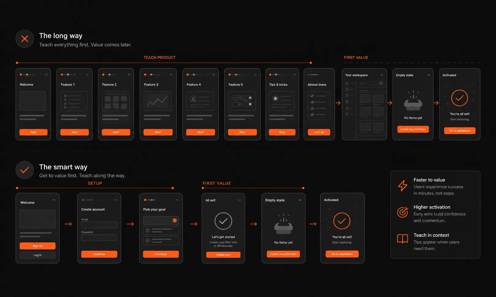
Users don't abandon products because they didn't understand the features. They abandon them because they didn't experience value fast enough. The gap between "I signed up" and "I got something useful out of this" is where most products lose people. Onboarding's real job is to close that gap as quickly as possible.

The distinction matters because it changes what you design. An onboarding flow built to teach prioritises comprehensiveness: show everything, explain every feature, make sure nothing is a surprise. An onboarding flow built to activate prioritises speed: get the user to their first meaningful outcome before they have time to doubt whether this was worth it.

These two goals produce completely different flows. A fintech product that spends four screens explaining how payment reminders work before letting a user send one will lose to a product that gets them to send their first reminder in 90 seconds — and then explains how it worked.

02

The three types of onboarding friction

Not all friction is equal. Some friction exists to be removed. Some exists to be deferred. And some exists because it's genuinely necessary and the job is to make it feel worth it.

Setup friction is the work a user must do to configure the product for their specific situation — connecting a bank account, uploading documents, entering business details. This friction is real, necessary, and unavoidable. The design job is to make it feel like investment, not barrier. Show progress. Show what unlocks after completion. Make the return on the effort visible immediately.

Learning friction is the cognitive load of understanding a new interface, new vocabulary, a new mental model. This friction is almost never necessary upfront. Progressive disclosure exists precisely to eliminate it: show users what they need when they need it, not everything upfront. The checklist-based tour that shows you around an empty product before you've decided whether you care is learning friction in its most harmful form.

Trust friction is the hesitation a user feels before committing — especially in a financial product. "Is this safe? What happens to my data? Will this charge me automatically?" This friction cannot be removed, but it can be answered. FAQ-style objection handling embedded in the flow at the moment users need it is more effective than a generic privacy policy link in the footer.

Most onboarding redesigns focus on reducing setup friction. The bigger wins are usually in eliminating unnecessary learning friction and pre-empting trust friction at the exact moment it arises.

03

The empty state problem

A common onboarding failure: a product that asks users to do a lot of setup before it can show them anything useful, then reveals a completely empty dashboard. You've just made the user work hard to see nothing.

Empty states are the most under-designed part of most products. They're treated as a placeholder — "you'll see data here once you add customers." But the empty state is actually the highest-stakes moment in the onboarding flow. It's the moment the user decides whether the product is worth continuing with.

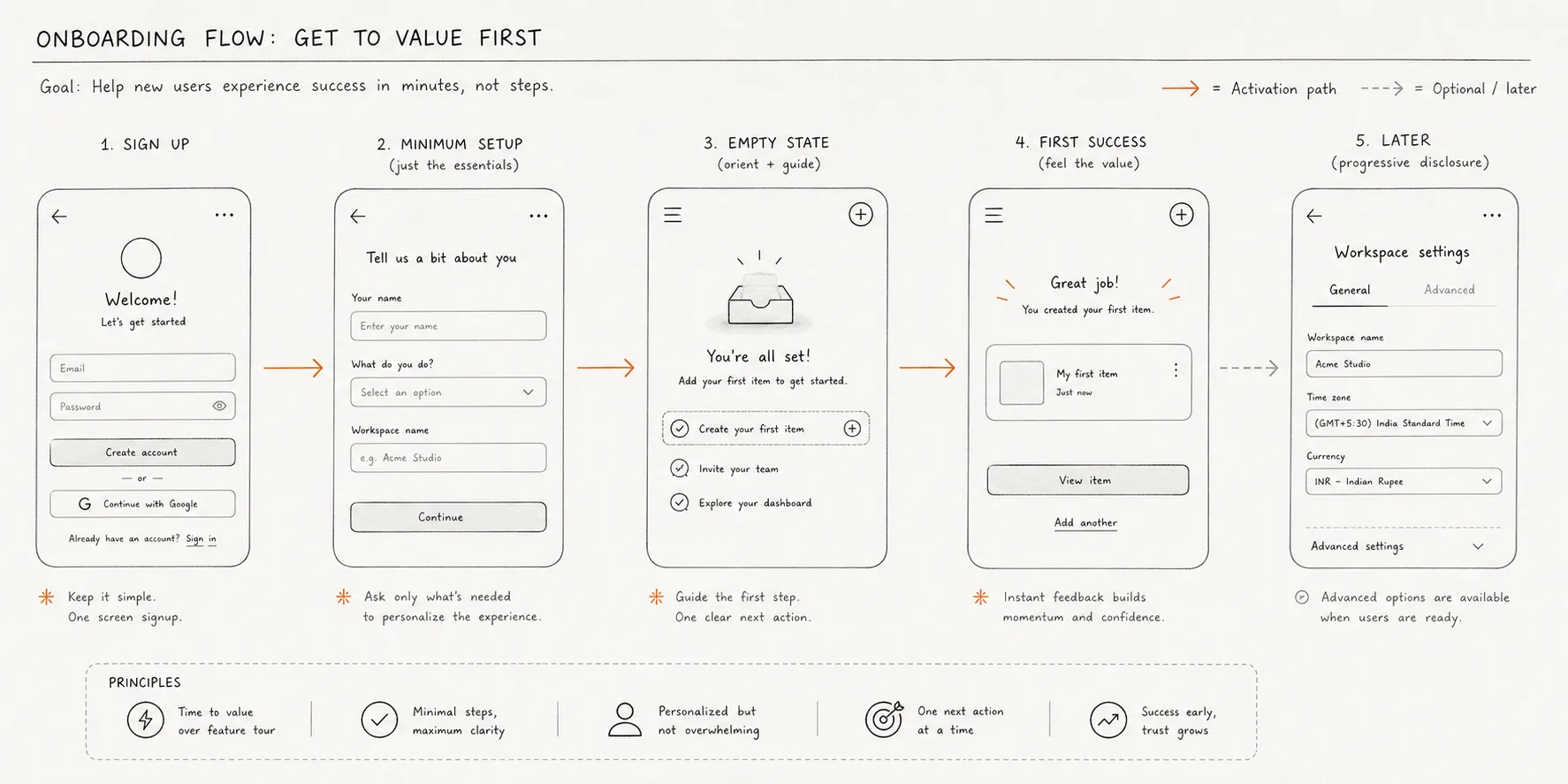
Good empty states do three things. They acknowledge the current state clearly — "You haven't added any customers yet" is better than a ghost illustration with no text. They make the next action obvious and immediate — a prominent CTA that starts the thing, not a generic "explore the dashboard" button. And they show a preview of what the populated state looks like — mockup data, example entries, or an illustration of the outcome — so the user can visualise the payoff of continuing.

The goal is to make the empty state feel like the beginning of something, not the absence of everything.

04

Progressive disclosure vs. upfront commitment

The fundamental onboarding design decision is when to ask for things. Every piece of information you request, every configuration step you require, every decision you force on a new user is a moment where they might leave.

The default is to ask for everything upfront — get the full picture before letting anyone in. This feels safe from a product and engineering perspective: you have the data you need, users can't encounter broken states because their profile is incomplete. But from a user experience perspective, it front-loads all the work and defers all the value. The user is giving before they've received anything.

Progressive disclosure flips this. Ask for the minimum required to deliver immediate value. Let the user experience the product. Then, at the moment their incomplete profile becomes relevant — when they try to do something that requires the information you haven't collected — ask for it. The context makes the request feel justified rather than arbitrary.

In practice, this means distinguishing between what's required to activate the user's first value moment and what's required for everything else. For a payment collection app, the first value moment might be sending a single payment reminder. You need a contact name and phone number — that's it. Bank account details, business registration, KYC documents: important, but not required for the first moment of value. Ask for those after the user has seen the product work.

The objection is that users who are partially onboarded might churn before completing setup. In practice, users who've experienced value once have a much stronger reason to complete setup than users who've only been through setup without experiencing value.

05

What good actually looks like

The best onboarding flows have a few things in common.

They're designed backwards from the first value moment. Start by defining the single interaction that would make a new user say "okay, I get it." Then design the shortest possible path to that moment, and put every other setup requirement after it.

They remove optionality from early steps. Decision fatigue is real. Every choice you ask a new user to make — which notification type, which dashboard layout, which currency format — is cognitive load spent on the product instead of on what the product is supposed to help them with. Default everything sensible and let users customise later.

They make progress visible and meaningful. A progress bar that says "2 of 7 steps complete" creates anxiety, not motivation. Progress indicators work when each step has an obvious outcome — "You're set up to send reminders" is more motivating than "Step 2 of 7."

They treat the confirmation state as the start of the relationship, not the end of setup. The moment a user completes their first meaningful action in your product is the highest-engagement moment you'll ever have with them. Don't waste it on a generic success screen. Use it to show them what just happened, what comes next, and why it matters.

← All writing