How Pre-Login Design Moved Login Metrics
How a video-led first experience improved Get Started from 60.5 to 73.4 and Login Success from 54.8 to 66.8 per 100 installs.
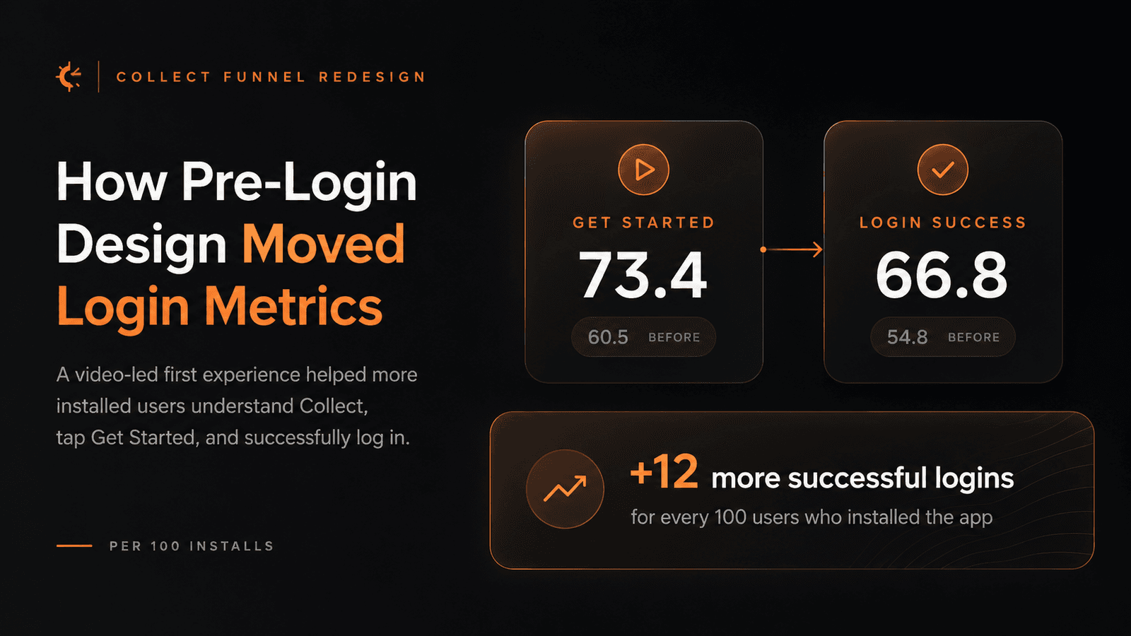
A pre-login redesign in Collect replaced static value props with video-led product context. The result was not just a cleaner first screen: per 100 installs, more users clicked Get Started and more users successfully logged in.
01
The goal was not a prettier login screen
Most login screens are treated like a doorway. You install the app, open it, enter your phone number, verify OTP, and only then does the product start explaining itself.
That works when the user already knows what the app does. It fails when the user is still asking a more basic question: why should I trust this app enough to continue?
That was the problem behind Collect’s pre-login redesign. Collect handles payments, mandates, collections, and money movement for business users, so the first few seconds are not cosmetic. Users are deciding whether the product feels legitimate, understandable, and worth continuing with.
02
The metric we wanted to move
The release went live on May 6, 2026. The success question was not “does the new screen look better?” It was “after users install Collect, do more of them click Get Started and successfully log in?”
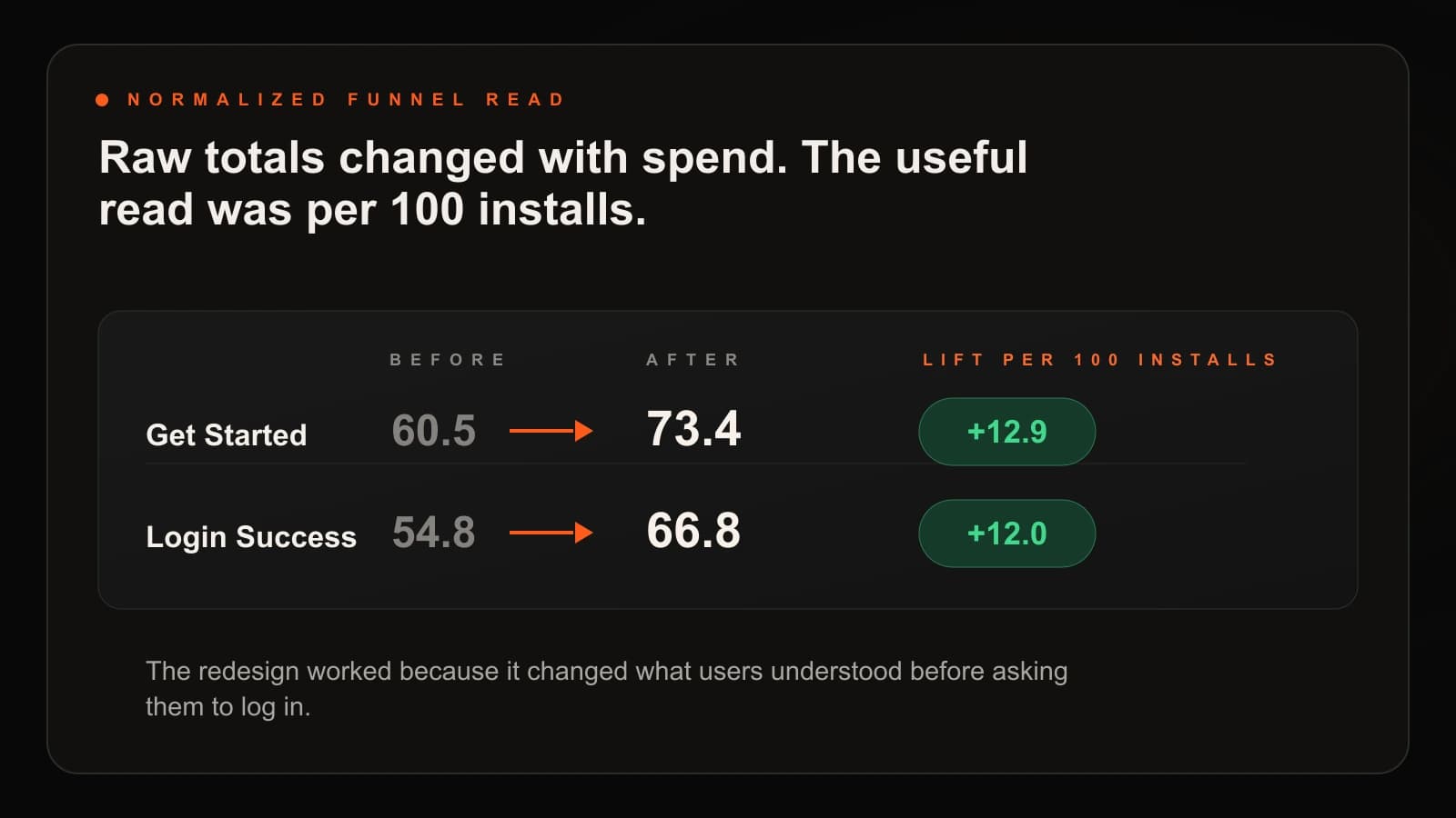
The first metric read was misleading. Raw Get Started and Login Success totals can move up or down because of ad spend, campaign volume, install quality, and acquisition mix. If install volume drops, raw login numbers may drop even if the product experience improves.
So the better question became: out of every 100 users who installed the app, how many clicked Get Started and how many successfully logged in?
03
The old flow explained Collect too passively
The earlier pre-login flow was clean and direct. It had the Collect brand, a welcome moment, a simple value prop, and then the mobile-number input.
The problem was not visual quality. The problem was how much understanding it expected from the user. A few static lines had to explain what Collect does, who it is for, whether it is safe, and why entering a mobile number was worth it.
For a known consumer app, that may be enough. For a fintech product used by business owners and operators, it leaves too many questions unanswered. Payments from whom? Is this for my business? Is this safe? What happens after I enter my number?
04
The new flow made the product concrete
The redesign shifted pre-login from static explanation to product understanding. Instead of relying only on value props, the new flow uses video-led context after the user opens the app.
That video is not decoration. It gives first-time users a faster way to understand what Collect does, who uses it, and why the product is relevant to their work. For users who are not already familiar with the product, that context matters before the login field appears.
The flow also brings trust proof closer to the decision moment: merchant trust, processed volume, security claims, payment-network context, and language cues. These details answer silent objections before the user has to commit.
05
What changed in the funnel
After the redesign, Get Started improved from 60.5 to 73.4 users per 100 installs. That means more installed users were willing to begin the login journey.
Login Success improved from 54.8 to 66.8 users per 100 installs. That matters more because it means the redesign did not just create curiosity. More users completed the path.
The useful lift was roughly 12 more successful logins for every 100 users who installed the app. That is the design story: the interface changed what users understood before the action, and the funnel moved because of it.
06
Why video helped
Video can be a weak product layer when it is used as a flashy wrapper around an unclear flow. Here, it had a practical job: compress product understanding before login.
A first-time user can understand more from a short, contextual explanation than from a static headline. That is especially useful for an operational fintech product where the value is not always obvious from the login screen alone.
The user is no longer tapping Get Started only because the UI tells them to. They are tapping because they have a clearer reason to continue.
07
The design lesson
Design impact is often discussed too softly. People say a design builds trust or improves clarity, but those words need to connect to behavior.
In this case, the chain was visible: video-led product context helped users understand Collect earlier, more users clicked Get Started, and more users successfully logged in.
Pre-login is easy to underestimate because it sits before the “real product.” But for unfamiliar users, it is part of the product. It is where they decide whether the app is relevant, trustworthy, and worth their time.