What Users Are Actually Doing on Your Page
Eye-tracking research, scrolling data, and the 50ms first-impression study. What decades of behavioral research actually says about how users read, scroll, and judge interfaces — and what it means for how we design.
01
Nobody reads your page the way you designed it
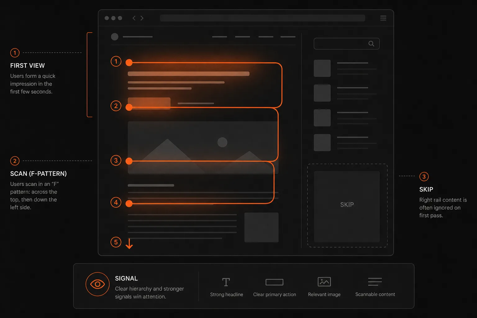
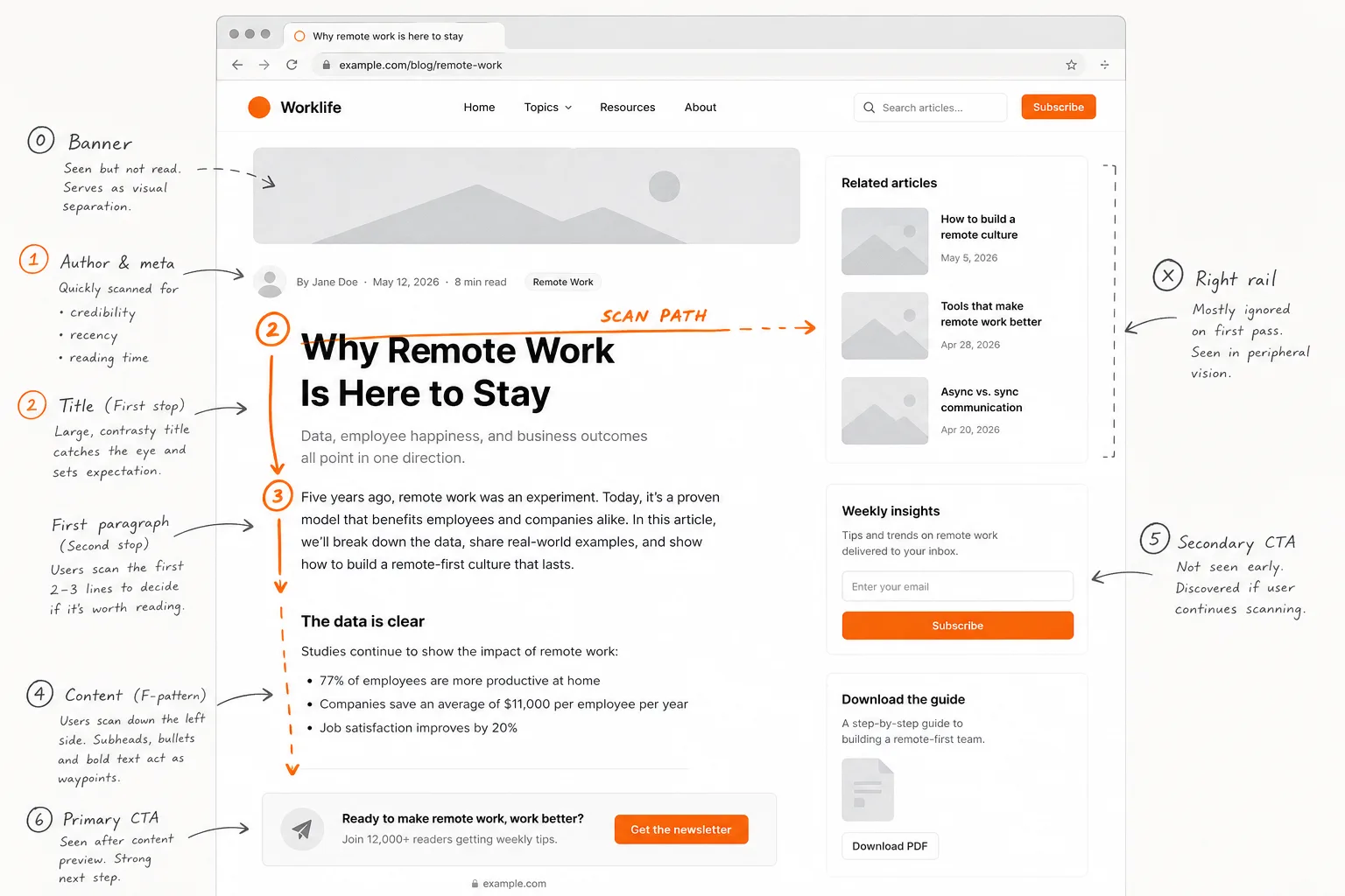
In 1997, Jakob Nielsen ran a study that changed how people thought about the web. He asked participants to read pages on a screen while tracking their eye movements. The result was not what anyone expected. People were not reading. They were scanning in an F-shaped pattern — a full horizontal sweep across the top, a second shorter sweep a bit further down, then a vertical scan down the left side. The text on the right half of most pages was barely seen.
The study has been replicated many times since, with 500+ participants across hundreds of pages. The F-pattern holds. It holds for news articles, product pages, search results, blog posts. The right side of your layout is a graveyard for content. If your call to action, your key stat, your most important feature lives in the right column, most users will never notice it.
This is not a failure of design. It is a feature of how human attention works. Scanning conserves cognitive effort. Users have learned that pages are mostly noise and have developed efficient strategies to extract signal quickly. The F-pattern is rational behavior in a high-noise environment.
What this means in practice: put your most important content at the very start of paragraphs, not buried in the middle or end. Use the first two words of any line as if they are headlines. Structure content so the left edge tells the story — because that is the only edge that reliably gets seen.
02
The banner blindness problem (and why it is getting worse)
In 2007, researchers showed participants a series of web pages and tracked what they looked at. Anything that looked like an advertisement — bordered box, bright color, positioned in a typical ad location — was ignored almost completely. Participants developed a perceptual filter that blocked these elements from conscious attention. They called it banner blindness.
The effect has gotten worse over time, not better. In a 2018 follow-up study, researchers found that banner-style elements in typical ad positions received attention from fewer than 20% of users — even when the content was genuinely useful and not an advertisement. The location and visual style of an element is processed before its content, and if the location pattern matches "advertisement," the content is never evaluated.
The implication for product design: any element that looks promotional gets ignored. This includes genuine alerts in banner-style placements, important notices in colored boxes at the top of pages, and product tips designed to look like ads. If the visual language says "you can skip this," users will skip it without reading it.
One measurement worth knowing: eye-tracking research on typical page layouts found that page elements in the top 25% of the viewport — the space most often used for announcements and banners — received less than 20% of total fixation time on average. The space that costs the most (top of page, above the fold) is often the most ignored. Earning attention requires looking like content, not like a notice.
03
The scrolling myth that designers kept building for
For years, designers built pages as if users would never scroll. "Above the fold" was treated as sacred. Everything important had to fit in the first screenful. The logic was intuitive: users see above the fold immediately, they have to work to see below it, therefore they will not bother.
The data tells a different story. A large-scale analysis of scrolling behavior found that 91% of page views include at least some scrolling. On long pages, the majority of engagement happens below the fold — not above it. Users scroll readily and habitually.
The caveat is that scroll depth drops off quickly. Users scroll to the point where the content stops being rewarding and then stop. The implication is not "cram everything above the fold" and it is not "users will find anything if they scroll far enough." The implication is: give users enough in the first view to want to continue, then reward them for continuing all the way down.
The above-the-fold panic produced a specific type of crowded, compromised design — dense, cluttered first screens that try to say everything simultaneously and end up communicating nothing clearly. A single clear value proposition in the first view, followed by content that earns continued attention, works better than trying to fit everything into the first screen.
04
First impressions form in 50 milliseconds
In 2006, Gitte Lindgaard published a study that became one of the most cited in UX research. Participants were shown websites for 500 milliseconds — half a second — and asked to rate their visual appeal. Those ratings correlated strongly with ratings from participants who spent as long as they wanted on the same pages. First impressions were formed in 50ms — the minimum exposure time they tested.
The study has been cited over 1,000 times and replicated with similar results. Fifty milliseconds. Before any text is read, before any navigation is used, before any product feature is understood, a user has formed a strong impression of the quality and credibility of your product.
What drives the 50ms impression is not content — it is visual design. Layout density, color harmony, typography choices, spacing consistency. A page with generous whitespace, clear visual hierarchy, and professional typography gets a positive first impression automatically. A page that is cluttered, inconsistent, or uses unexpected visual conventions gets a negative one.
The practical consequence: visual polish is not vanity. It is first-impression management, and first impressions compound. A user who forms a positive visual impression at 50ms is more likely to give the product time and benefit of the doubt. A user who forms a negative one is primed to find problems. Effort spent on spacing, type scale, and visual hierarchy pays off before a single word is read.
05
What the research actually recommends
Taking these findings together, a few practical principles hold across contexts. Left-justify your most important content — the right side of pages gets dramatically less attention on average. Do not make important things look like advertisements. Earn scroll depth with the first view rather than assuming users will search.
The strongest finding across all eye-tracking and behavioral research is this: users are not lazy, but they are efficient. They have limited attention and have learned to allocate it away from noise. The job of design is to look like signal, not noise — to make the important things visually distinct from the unimportant things, and to reward the attention users give.
The failure mode that this research reveals is not unique to any one product. It is the assumption that users will read what you wrote, in the order you wrote it, with the attention you intended. They will not. They will scan, skip, and skip again. Design for how people actually read — not for how you hope they will.