WorkWritingAboutContactLet's talk →
ResearchEmerging MarketsProduct Design

Designing for Users You Haven't Met

Most designers default to designing for users who look like themselves. When your users are significantly different from you — different vocabulary, different devices, different relationship with technology — that default breaks everything.

01

The assumption problem

Most product designers design for someone close to themselves. Not intentionally — it's the path of least resistance. When you're building quickly and don't have time for exhaustive research, you fall back on what you know. Your own mental model. Your own technical comfort level. Your own vocabulary.

This works reasonably well when your users are similar to you. It fails badly when they're not.

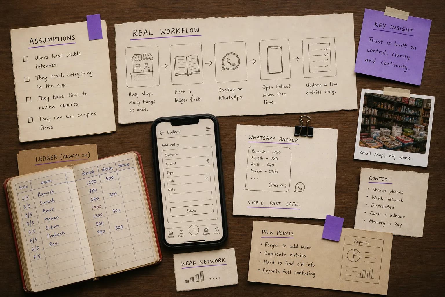
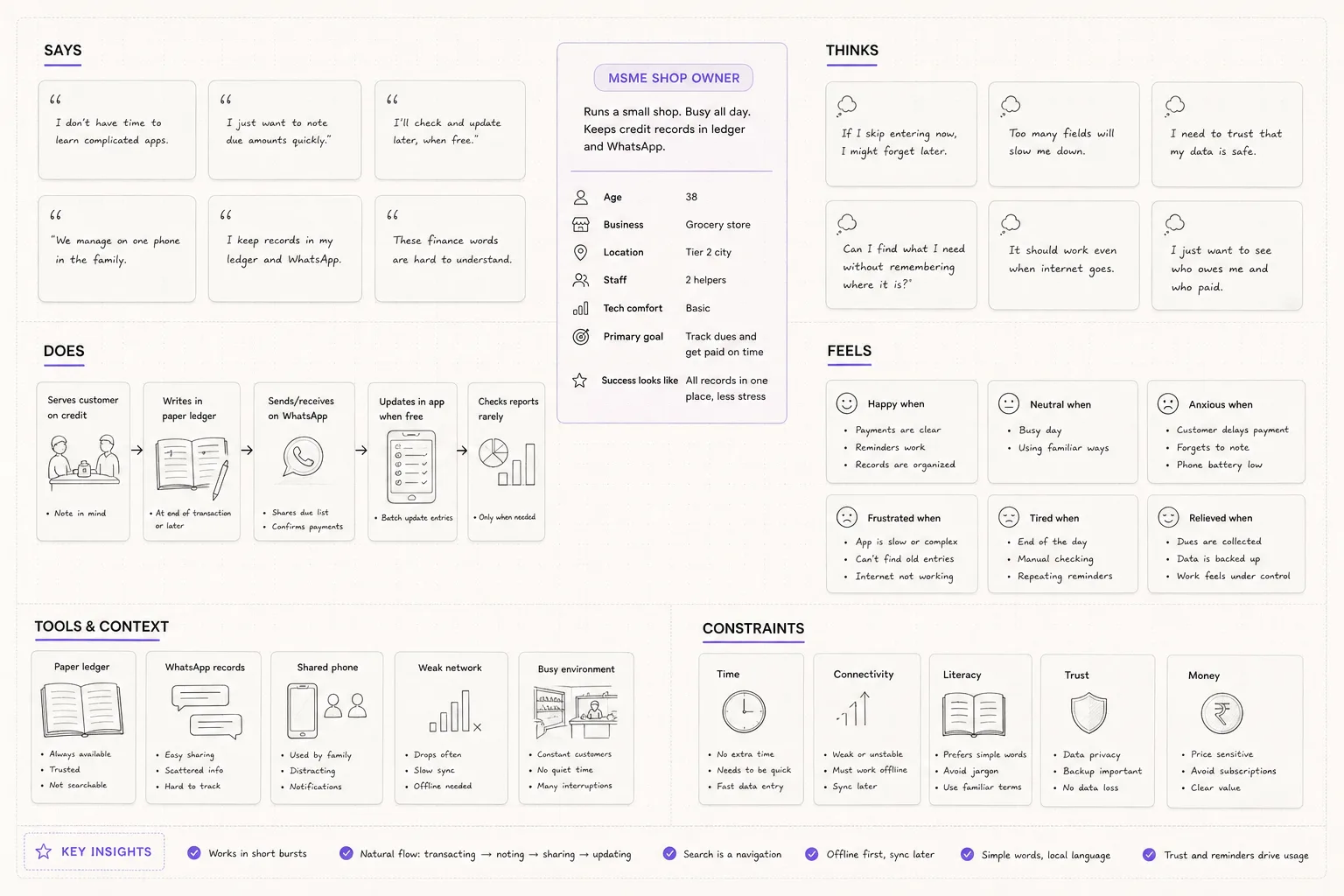
Designing Collect — a payment collection app for Indian MSMEs — forced me into this problem immediately. The target user was a jeweller in a tier-2 city who had been running their business on a handwritten ledger and WhatsApp for fifteen years. Their relationship with technology was completely different from mine. Their relationship with financial terminology was different. Their visual literacy — their ability to interpret icons, charts, and interface conventions — was different.

The most dangerous moment in designing for an unfamiliar user is when you think you understand them after a brief description. "MSMEs, low digital literacy, price-sensitive" — these labels create a false sense of understanding. Labels are not mental models. The actual behavior of real people always has more complexity, more contradiction, and more insight than any label contains.

02

What field research reveals that interviews miss

User interviews are useful. They are not sufficient when you're designing for users who are significantly different from yourself.

The problem with interviews is that they're an artificial context. A user sitting across from a designer, being asked questions about their workflow, will describe their workflow as they think it works or as they think it should work — not necessarily as it actually works. They'll use vocabulary they think you expect. They'll describe the rational version of their behavior, not the real version.

Field research — sitting with users in their actual environment while they do their actual work — reveals things interviews never will. It reveals workarounds: the WhatsApp group a business owner uses to track which customers have paid because the app doesn't make it easy enough. The paper printout pinned to the wall next to the phone that has the information they look at most often. The feature nobody uses because the label is confusing.

Visiting distributors and jewellers in their shops while designing Collect, I found users doing things with the app that surprised me consistently. They were using the search function to navigate — not because the navigation was hard to find, but because search felt faster and more familiar. They were sharing screenshots of the app with their staff instead of giving staff app access, because they didn't trust the access controls. They were keeping a parallel WhatsApp record of every transaction as a backup, because they didn't fully trust the digital record.

None of this would have emerged from an interview. All of it was directly relevant to the design.

03

Language as a design material

Interface copy is not a finishing task. It's a core design decision, especially when your users have different vocabulary from your product team.

Financial products are especially prone to vocabulary mismatch. Terms like "mandate," "NACH," "UPI Autopay," "reconciliation," "receivables" — these are standard in fintech, and completely unfamiliar to a business owner who manages their finances in their local language and thinks of their business in terms of what they're owed and what they've collected.

"Mandate" is the technical term for an autopay authorization. In Collect, we used "auto-debit setup" instead. Not because the technical term is wrong, but because "auto-debit setup" is what the user already understood and expected. Meeting users in their vocabulary costs nothing and reduces friction significantly.

The broader principle: every word in your interface is a decision. The default is to use the vocabulary your team uses internally. The right choice is to use the vocabulary your users use in their lives. These are often different, and the gap between them is a friction cost paid by every user, every time.

The practical test is simple: read your interface copy to someone representative of your users and note every word that requires explanation. Each of those words is a candidate for replacement.

04

The practical accommodations that compound

Designing for users with different technical familiarity or different physical contexts requires adjustments that feel small individually but compound significantly.

Touch targets: a 44×44px touch target is the minimum for comfortable use, but on a budget Android device held in an ambient environment — a shop floor, a market stall — this is not sufficient. Users with larger hands, users who are moving, users whose attention is divided need larger targets. 56×56px was our working standard for primary actions in Collect. It felt oversized in prototypes and correct in the field.

Text size: "readable" on a designer's retina MacBook is not readable on a 5.5-inch 720p Android phone held at arm's length. Body text at 14px that looks fine in your design tool will fail in the real environment. 16px minimum for body, 14px for secondary information, 12px for labels — and only if those labels are genuinely secondary.

Network tolerance: users in tier-2 and tier-3 cities often have inconsistent connectivity. An app that assumes fast, reliable internet will fail them at the worst moments. Every network call needs an explicit loading state and an explicit failure state with a retry action. "Something went wrong" is not a failure state. "Couldn't load — tap to retry" is.

Confirmation clarity: when every action involving money requires a confirmation, the confirmation must be unambiguous. Amount, recipient, action — all spelled out. Never just "Confirm" on a button. Always what you're confirming, for how much, to whom.

05

Why designing for edge users makes products better for everyone

There's a useful principle in accessibility: when you design for the most constrained version of a user, you usually make the experience better for all users. Captions designed for deaf users help everyone in noisy environments. High-contrast design for users with low vision helps everyone looking at screens in sunlight.

The same principle applies to designing for users who are less technically familiar, who use the product in more demanding physical contexts, or who have less tolerance for ambiguity.

When you design for a user who'll be confused by technical vocabulary, you end up with copy that's clearer for everyone. When you design for a user on a slow network, you end up with loading states and error states that make the product feel more reliable for everyone. When you design for larger touch targets because your users are in motion, you create an interface that's easier for everyone to use.

The instinct is to design for the "average" user — the digitally comfortable, fast-network, familiar-vocabulary user — and then accommodate the edge cases as an afterthought. The better approach is to design for the most demanding version of your user first, and let the design simplify from there.

The products I've found most impressive don't feel like they were designed for a sophisticated user who was then simplified for mass adoption. They feel like they were designed for real human beings, and the sophistication emerges from clarity rather than complexity.

← All writing