The Confirmation Screen Nobody Sees
Why auto-dismissing confirmations fail distracted MSME users.
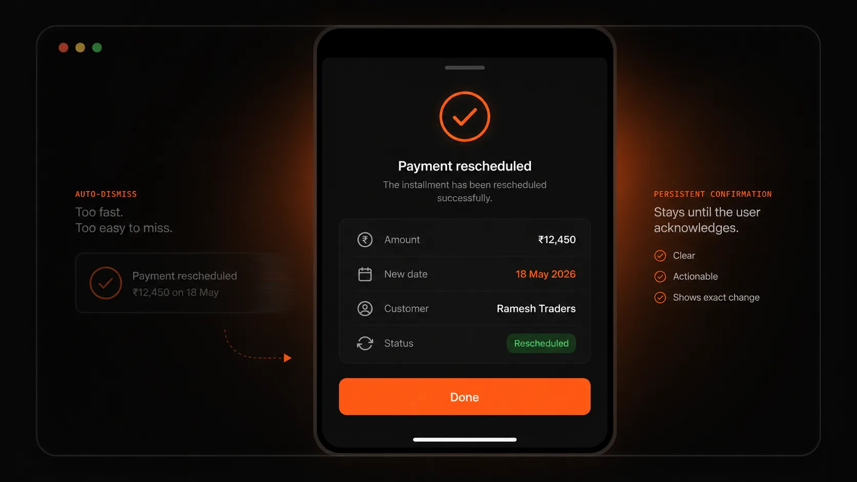
A confirmation that disappears on its own is designed for the system, not the user. Collect’s MSME users were often serving a customer when they tapped an action, so the confirmation needed to wait and show exactly what changed.
01
The problem with confirmations that disappear
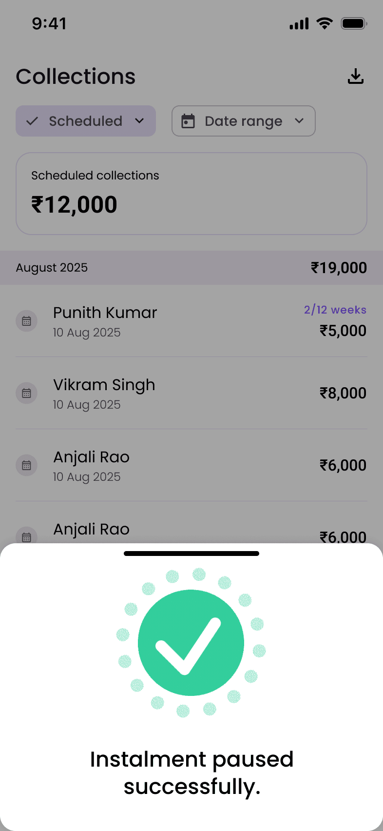
Most confirmation screens assume the user is watching. The action succeeds, a checkmark appears, the UI auto-dismisses, and the system considers the job finished.
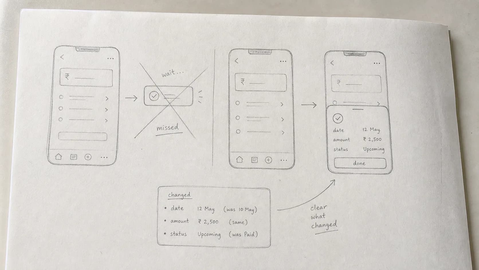
Collect’s users were not always watching. A shopkeeper might reschedule an instalment while talking to staff, serving a customer, or counting cash. They tap, look away, and by the time they look back the confirmation is gone.
That creates real uncertainty. Did the reschedule happen? Did the app return to the list because it worked or because it failed? A user who is unsure may repeat the action or spend time verifying something the interface should have made clear.
02
The old design answered the wrong question
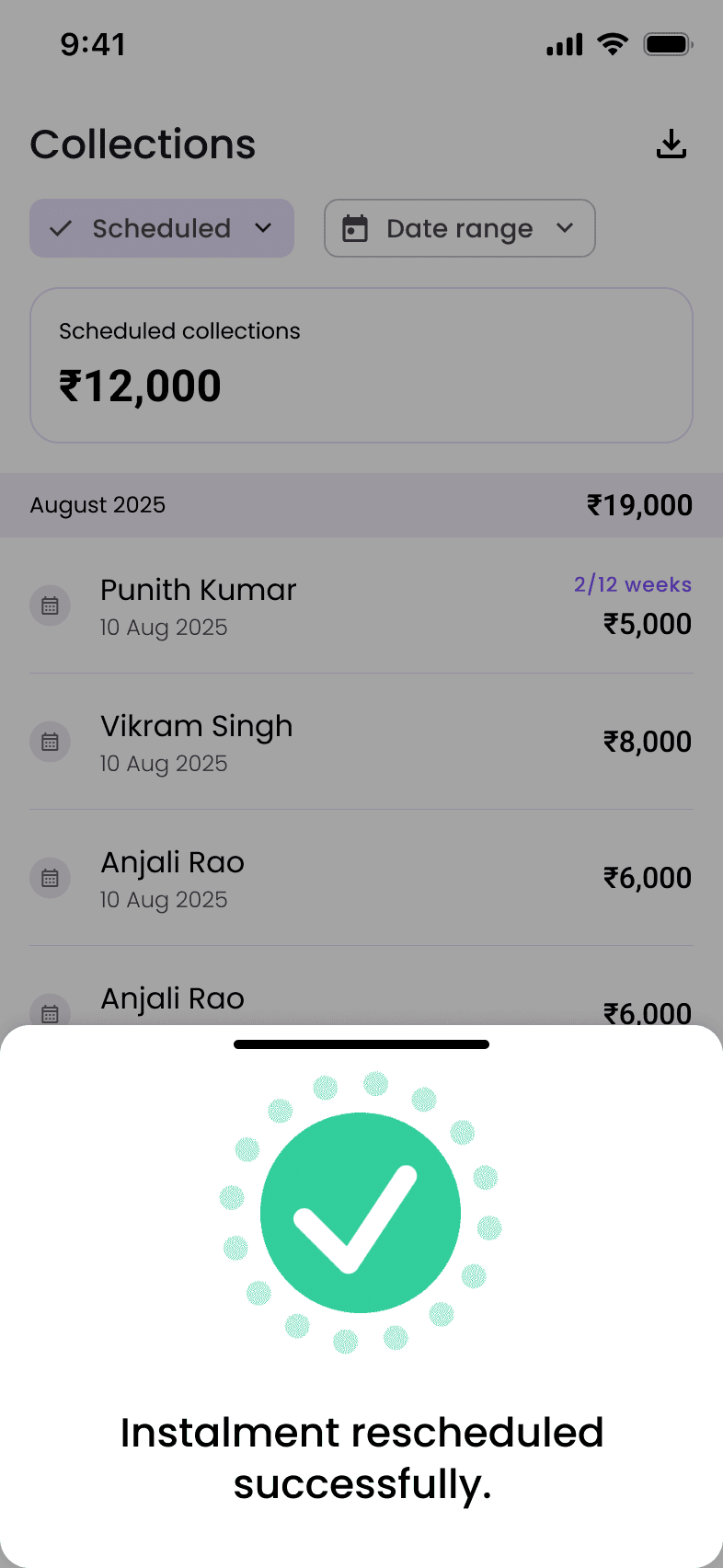
The original confirmation answered “did the system process the action?” It did not answer the user’s actual question: “is the specific thing I wanted now done?”
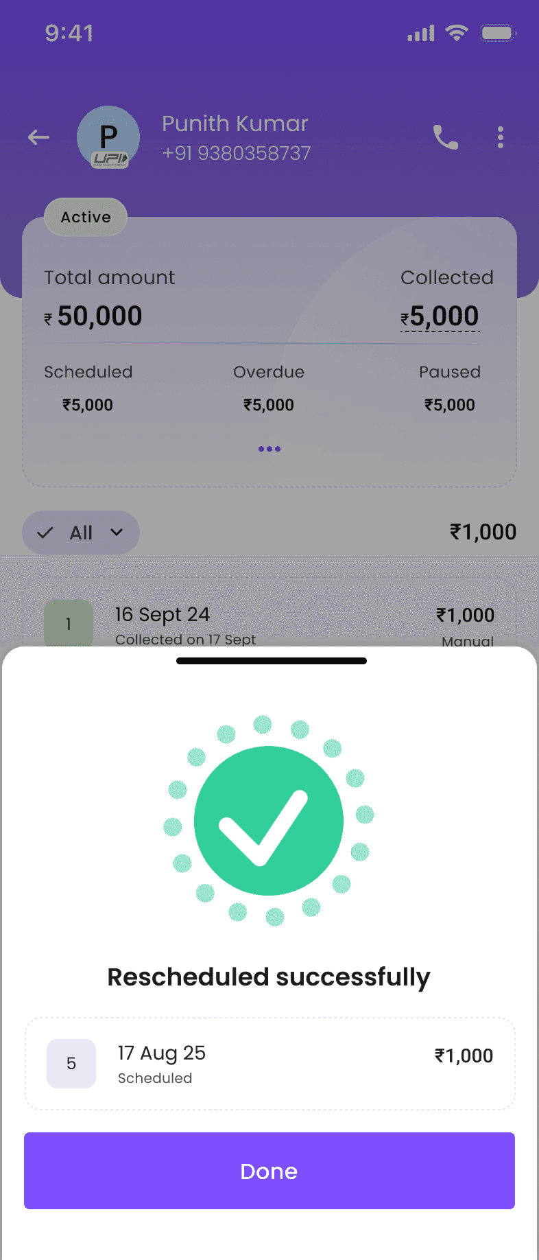
For financial actions, specificity matters. “Rescheduled” is weaker than showing the customer, instalment number, amount, and new date. The user needs the new state of the record, not a generic celebration.
03
Two changes fixed the pattern
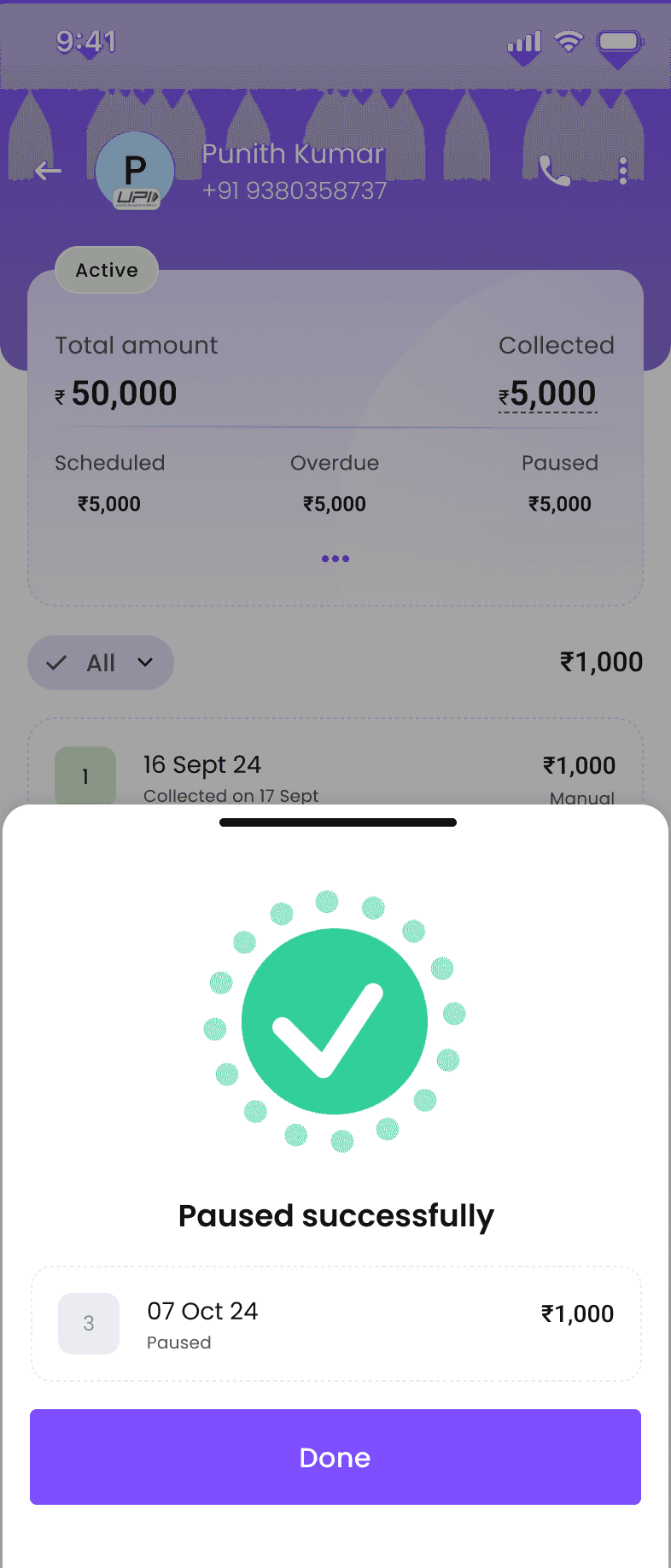
First, the confirmation waits. It stays on screen until the user taps Done. That turns the phone into a temporary memory aid instead of another thing the user has to watch carefully.
Second, the sheet shows what changed. The redesigned state includes the affected instalment, the date, the amount, and the updated status. It is a receipt for the action, not just a checkmark.
The Done button matters because it gives control back to the user. The confirmation ends when the user has understood it, not when a timer expires.
04
The principle behind it
Any action that changes a specific record should confirm the specific new state of that record. Generic success messages are acceptable for low-stakes actions. They are weak for money, dates, people, permissions, and irreversible changes.
A good confirmation makes the new state visible, keeps it visible until acknowledged, and uses the user’s vocabulary instead of internal system language.