Collect
MSMEs were chasing payments manually. I designed every screen of the product we built to fix that — from zero.
0→1
Built from scratch
500+
Beta businesses
100%
Solo design
2023
Shipped
The Problem
Indian MSMEs — jewellers, retailers, distributors — were drowning in manual payment tracking. WhatsApp messages, paper ledgers, phone calls. Zero visibility, zero automation.
The Solution
A mobile-first collection app that automates payment reminders, tracks dues, and gives business owners a real-time ledger — all with an interface that works for a jeweller in Rajasthan.
01
MSMEs in India operate on trust-based credit. A jeweller might have 200 customers with open balances — tracked in a notebook, followed up on WhatsApp, disputed over the phone. No automation, no digital record, no visibility. Tracking this manually across hundreds of relationships is a full-time job, not a business function. I spent weeks on field research: visiting distributors in HSR Layout, speaking with jewellers in Bengaluru, understanding the actual paper workflows before I touched Figma.
02
Through 20+ user interviews, I identified 3 core pain points: (1) Forgetting who owes what — memory fails at scale, (2) Awkward follow-up calls — chasing a customer for money damages the relationship, (3) No digital record for disputes — when a customer claims they paid and there's no proof, trust breaks. These three became the product pillars: a real-time ledger, automated non-awkward reminders, and an audit trail.
03
The hardest design problem in a payment app isn't the flow — it's trust. When money is involved, a single confusing screen costs the user real rupees and the business a support call. I designed every confirmation state to overcommunicate: amounts are large and readable, recipient names are prominent, and every action has an explicit success state. Error messages are human — not 'Transaction failed (ERR_402)' but 'This payment didn't go through — check the account number and try again.' Trust is earned one interaction at a time.
04
Collect surfaces the right information at the right time. The home screen shows today's pending collections at a glance — no digging. Sending a payment reminder is two taps and uses pre-written, non-awkward language so the business owner doesn't have to choose their words. Adding a customer is a single short form. The full ledger is always one tap away. The app does the cognitive work so the business owner can focus on the relationship.
Design Process
to shipped.
01
Paper sketch
Map the flow, not the pixels
02
Flow diagram
Structure screens in FigJam
03
Figma design
Build the actual product
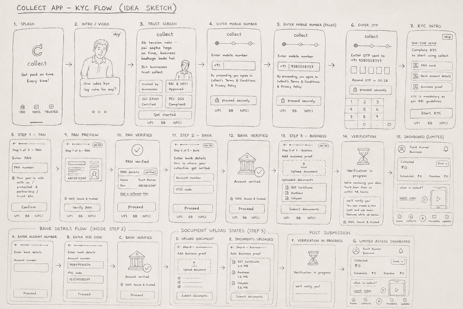
Collect App — KYC Flow (Idea Sketch, pre-Figma)
User Flow
is structured.
Interactive Prototype
the real thing.
Outcome
Next project